What does "Pantone Of The Year" Say about Society? Here's Why It Matters
Every year, Pantone, the globally recognized color matching system, unveils its highly anticipated 'Color of the Year.' This annual selection sets design trends across various industries, and Pantone Color of the Year reflects global moods, societal changes, and cultural shifts. The chosen color often encapsulates the zeitgeist, visually representing society's collective emotional state and aspirations. Industry professionals, including showroom owners, distributors, manufacturers, architects, and even general contractors, can harness the power of the Pantone Color of the Year to make more informed, trend-aligned decisions in their respective fields.
For instance, showroom owners can strategically incorporate the Color of the Year into their display designs to create visually appealing and on-trend environments that resonate with customers. In 2021, Pantone selected Aegean Teal as its Color of the Year, representing warmth, welcoming nature, and a sense of calm stability. Showroom owners who adopted this soothing blue-green hue in their displays could create an atmosphere of comfort and tranquility, mirroring the collective desire for these qualities during the challenging times of the global pandemic. By aligning their spaces with this color trend, they could attract more customers and create a more inviting shopping experience.
Distributors and manufacturers can also capitalize on these color trends to stay ahead. Selecting Very Peri as the 2022 Color of the Year presented a unique business opportunity. With its violet-red undertones, this dynamic periwinkle-blue hue symbolized our transformative times and the emergence of a new reality. By incorporating Very Peri into their product lines and marketing strategies, distributors and manufacturers could align themselves with the global narrative of change and innovation. This strategic use of color could influence the production of goods, from fashion items to home decor, and inform marketing campaigns that resonated with consumers' desire for stability and optimism in uncertain times. By doing so, businesses could position themselves as trend-savvy and responsive to consumer needs, potentially gaining a competitive edge in the market.
Architects can draw significant inspiration from the Pantone Color of the Year, using it as a powerful tool to inform their designs and create spaces that resonate with current societal moods. The 2023 Color of the Year, Viva Magenta, offered a vibrant palette to work with. This nuanced crimson tone vibrates with vigor and strength, embodying a new power signal. Architects could incorporate this bold hue into their projects in various ways - from accent walls in commercial spaces to color pops in residential interiors. By doing so, they could create environments that reflect the world's gradual recovery from the pandemic and the collective need to navigate uncertainties with confidence and optimism. Viva Magenta's balance between warm and cool tones also provided versatility in design applications, allowing architects to create energizing and grounding spaces.
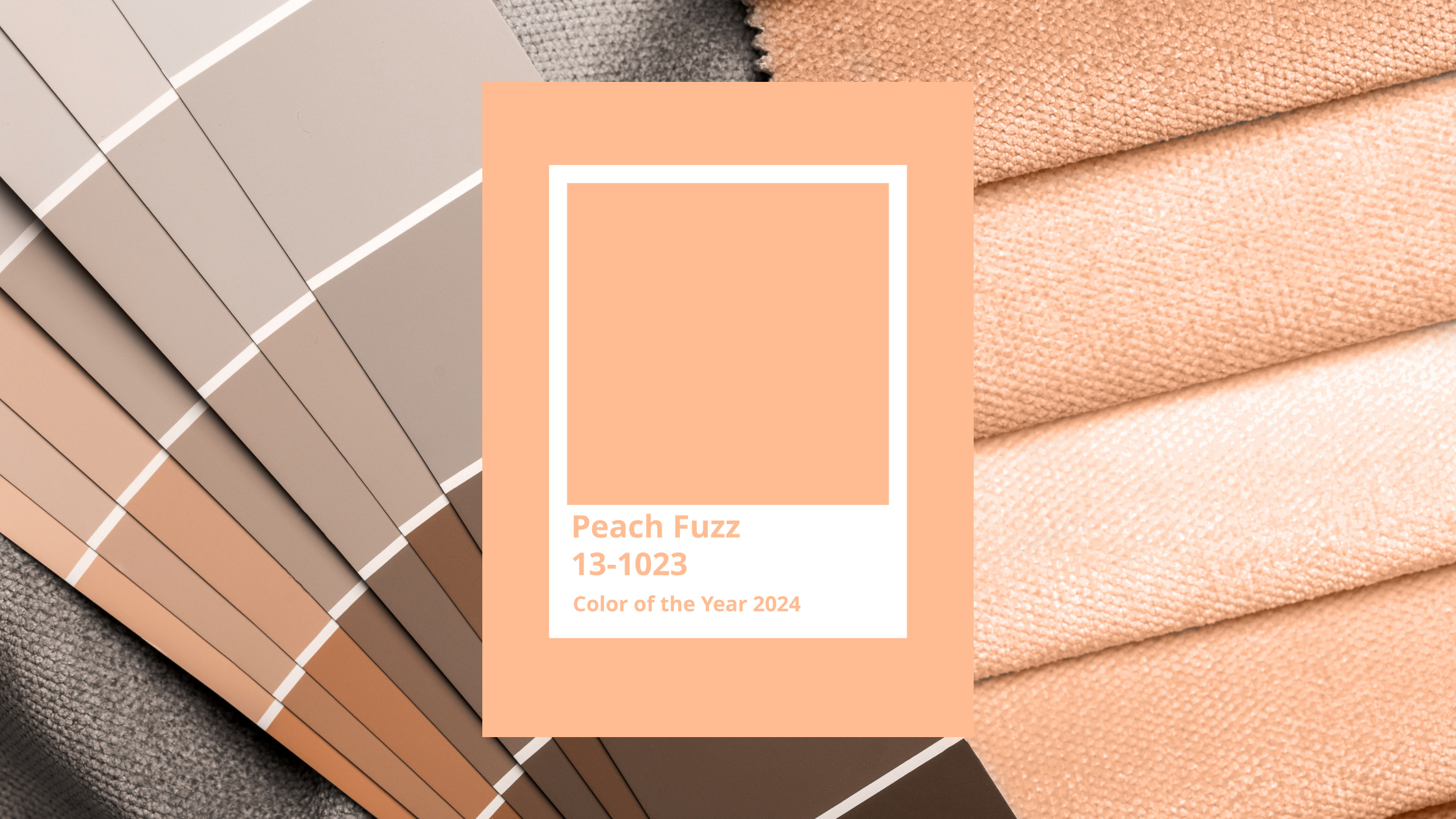
General contractors play a crucial role in bringing design concepts to life, and their consideration of the Pantone Color of the Year can ensure that projects are structurally sound and aesthetically current. For example, the 2024 Color of the Year, Peach Fuzz, symbolizes kindness, compassion, and connection - qualities that have become increasingly valued in our post-pandemic world. Contractors could incorporate this gentle, nurturing hue throughout their projects. This might involve selecting peach-toned tiles for a bathroom or choosing furnishings and textiles in this warm, inviting color. By thoughtfully integrating Peach Fuzz into their work, contractors can create spaces that align with current design trends and foster a sense of comfort and unity, meeting the emotional needs of occupants in both residential and commercial settings.
The phenomenon of how a single color can encapsulate our collective emotional state and influence design trends across multiple industries is genuinely fascinating. It demonstrates the power of color psychology and its impact on our lived experiences. By staying attuned to the Pantone Color of the Year, professionals across various design and construction industry sectors - from showroom owners and distributors to manufacturers, architects, and general contractors - can enhance their work in meaningful ways. This attention to color trends allows them to stay relevant in a rapidly changing market, create more engaging and emotionally resonant spaces, and ultimately meet their customers' and clients' evolving needs and desires.
To further leverage the power of color in their projects, industry professionals can utilize Haystack's intelligent search technology, which includes a color palette generator. This innovative tool allows users to find products that complement specific Pantone colors, including the Color of the Year. By inputting the desired Pantone color, professionals can discover a range of products - from furniture and textiles to lighting and accessories - that harmonize with the chosen hue. This feature streamlines the product selection process and ensures that the final design aligns perfectly with current color trends and client preferences. The synergy between global color trends and smart search technology empowers professionals to make informed decisions, resulting in aesthetically pleasing and emotionally resonant spaces.


